“I know it’s a long shot” I typed to the CX person in the support chat “but is there anybody at Amazon I could speak to who understands book design?” I admit it was a bit of a passive aggressive comment. However it was now 2 days till my big book launch, I was around 20 messages in, and getting absolutely nowhere. Amazon KDP was refusing to accept my book cover, despite passing all their automated checks and printing numerous author copies to ensure everything was coming out fine, which it was. Sadly somebody in their QA department had objected to my book cover and it seemed like there was nothing I could do about it.

You have to understand that It had taken months to land on the perfect cover. The colour was vibrant, the typography was energetic and the layout communicated a sense of both growth and constraint— both through the hockey stick text path, and the fact that it spilled over the edges of the page. In short I thought the cover was a brilliant metaphor for the content of the book. I’d also been living with the cover for about 6-months now, so was emotionally committed.
The cover design project started as many projects do—with an inspirational mood board. Because the book was aimed at startups, one option was to explore a hand drawn aesthetic. It was also about growth, so it needed to contain some sort of growth metaphor. You can start to see some of these elements in the examples I selected.
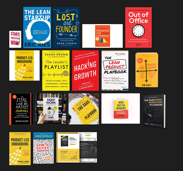
Working with a cover designer friend, we started with a few rough ideas…

…before settling on 4 possible directions. I shared these concepts with around a dozen friends at the start of the year and got a bunch of great feedback.




While I felt they all had something about them, the ones on the left felt a little safer and more traditional, while the ones on the right had a bit more character. We worked these up some more…

Combined the best elements together….

And ended up with something I was pretty happy with.

I was using two different services to print the book. Amazon KDP would be supplying books for the Amazon platforms, while Ingram Spark would fulfil bookshop orders. Ingram Spark is a little more expensive, especially when it comes to shipping. However the print quality is a touch better, and you have more control over pricing. You can choose to have Amazon KDP do the bookshop orders for you as well, but ironically they also use Ingram Spark for this. As such it makes sense to use them separately, and in the end I’m glad I did.
The Amazon KDP platform is fairly nice. They have a bunch of automated checks which the designs passed. Once you’ve passed these checks you can order some sample copies. Once you’re happy with these you just hit publish. Ingram Sparks has a similar process, except that it’s manual rather than automated, which means it takes a little longer. As such I hit publish on Ingram Spark a few weeks before Amazon, got the demo copies to check they looked OK, and everything was ready to go.
One of the other benefits of launching with Ingram Spark first is that while Amazon KDP doesn’t allow people to pre-order print books on Amazon (for some bizarre reason), Ingram Spark does. So if you pre-ordered the book on Amazon, you would have actually got one of the Ingram Spark copies. The main downside of using Ingram Spark for Amazon sales is that the shipping time can be weeks rather than hours, which puts some people off. In fact I had a few friends say they bought the Kindle version purely because the shipping time on Amazon at launch was too long.
Anyway where’s where everything started to go wrong.
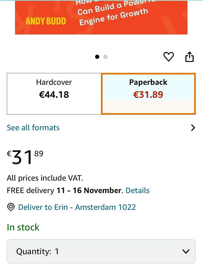
A week or so before launch I hit publish on the KDP platform, assuming that everything had already been approved. However unbeknownst to me there was one last manual check which happened. Somebody from the Amazon KDP QA team would take one final look at the book, just to make sure nothing was obviously wrong.
About 5 days before launch I got a vague email from Amazon saying that my book cover had been rejected. The email said that you couldn’t have anything on the cover which you wanted to be visible within a few millimetres of the edge, incase it got cut off with the book trimming. Fortunately there was nothing on my book cover that risked being cut off, so I asked for clarification.
I was told that the problem was actually with the cover title itself. I must have made a mistake as the title was being clipped. No worries though. I probably didn’t know how to use my design software so if I spoke to their CX team they could walk me through how my design software worked and we could get the cover sorted.
I laughed as somebody thought the cover text being cut off was accidental. So I went back to them to explain it was actually deliberate, and not to worry.
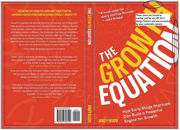
The response I got was something along the lines of “I’m sorry, but your book cover doesn’t meet our guidlines. We do QA to ensure that our readers get the best version of the book cover possible, so please go back and right this error.”
I got onto their live chat tool and tried to appeal the decision. At first this felt like an obvious misunderstanding that would get solved quickly.


When the book cover got rejected again I reiterated that this wasn’t an error but actually a common design technique. I pointed to the best selling book about book design on Amazon which used this design treatment. I also pointed to this award winning book cover which used the same conceit.


The response I got back was priceless. “Congratulations on your book’s remarkable achievement in design awards. This is truly impressive. While we appreciate the deliberate design choices you’ve made, I regret to inform you that the current cover file does not meet our submission requirements. Our quality review team has carefully assessed the file and determined that it does not align with our guidelines. To move forward with publication, we’ll need a revised cover that adheres to our standards.”
They clearly hadn’t even bothered to read my email. I knew the fight was lost. However I had one last trick up my sleeve. The book had been rejected because the title hung over the edge. What if I could create a similar look, while making sure that it stayed within their technical guidlines. This would actually make a fun case study around design innovation and working within constrains if I could pull this off. So I uploaded a new cover and crossed my fingers.

Sadly this cover was also rejected. While the design was now within the book margin, they wouldn’t allow it because the title text was being obscured. I knew at this point the battle was lost, and was forced to submit a compromised cover design to get past Amazons “Design Police.”
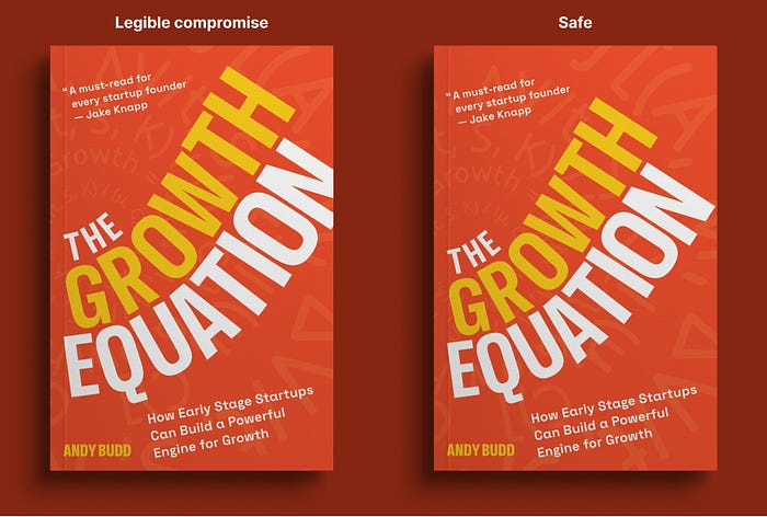
If you buy the book today from a bookshop like Blackwells in the UK or Powell’s in the US, you still get the version of the cover as intended. However if you buy the book from Amazon, you get the degraded version. Most people won’t notice, but I can’t help but hold a grudge that Amazon ruined my cover design.
This whole back and forth was happening the week of my book launch which was super stressful. So for the bulk of the first week, if you did buy a print copy of my book, it would have been printed by Ingram Spark. However two things happened here. First, a bunch of shady book sellers noticed that the book wasn’t yet being sold by Amazon directly, so they bought the books through Ingram Spark and sold them on Amazon at around 30% above the RRP. Secondly these books were taking several weeks to ship, frustrating my early readers. This was one of the reasons I had to compromise on the Amazon cover. Essentially to stop my early supporters from getting scammed by bottom feeders.
As you can tell, this leaves a really bad taste in my mouth. Self publishing via Amazon KDP is meant to empower authors. However in my case it did the exact opposite. So if I find myself writing a book again I’ll almost certainly go through a publisher to avoid another run in with Amazons “Design Police.”
